Adding a Premium tier to an existing system
- Role
- Lead UX Designer
Make the new pass rewards feel worth the higher price for the same effort.

FarmVille 2 already sold an Elite Battle Pass. Users were inclined to pay a higher price for 15x the rewards.
Why would anyone switch to the pricier pass?
Players had to see the extra value at a glance, and trust that the extra rewards wouldn't take extra effort.
Three tiers, one event
Every Battle Pass runs alongside a limited-time event. Everyone gets the free track. Elite was the only paid option.
Premium is new: it includes everything in Elite, plus bigger rewards, exclusive perks and cosmetics.
Players were already asking for it
“We can’t wait for more Battlepass content! We’re happy to pay more if the value is there.”
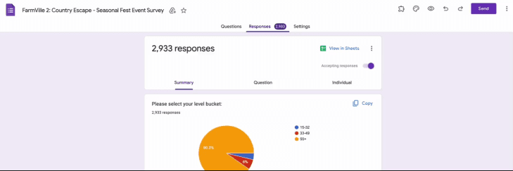
High-value player survey, 2000+ responses
Learn from games that already do this well
How Township, FarmVille 3 and Brawl Stars stack paid tiers, and what makes the top tier feel special.
2000+ responses on pain points and which rewards players actually want, which helped us pick the Premium rewards.
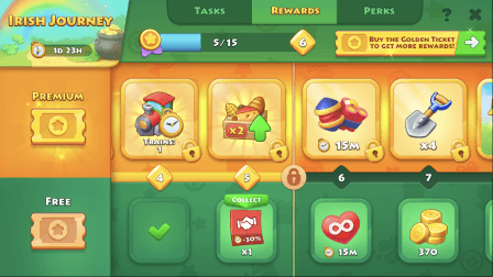
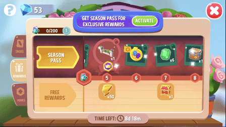

Three ways to fit a third tier
Three tiers, stacked: Free, Elite and Premium as three rows.
Two tiers, stacked: Free below, Elite and Premium sharing one row.
Separate screens: one Battle Pass for Elite, another for Premium.
Weighing each option
Two tiers, stacked
Pros: low UX cost, no re-tuning, familiar progression, art can be reused. Cons: new milestones may look like more work, and there are more rewards to keep track of. UX note: make Premium rewards read as extras on existing milestones, not new ones.
Three tiers, stacked
Pros: no re-tuning, and two parallel tracks are easy to compare. Cons: the whole main UI gets redone, 30 new milestones each need to feel valuable, and art can't be reused. UX note: needs clear parallel tracks on a full-screen UI.
Two separate passes
Pros: suits both casual and hardcore players, with more revenue potential. Cons: extra UX for a second pass, plus balancing rewards and tasks across both. UX note: clear differences between the passes, with their own FTUEs and surfacing.
Premium sits right next to Elite
Two tiers, stacked. Premium rewards sit beside the Elite rewards with a richer visual treatment, so players compare them in one glance, with minimal redesign.
left the Premium milestones unnumbered and gave them a smaller, in-between treatment, so they read as a bonus on the same path, not more work.
Elite was the only paid row
One paid track with free rewards underneath. Nothing to upsell to, and no room for a higher tier.
Premium rewards stacked on top of Elite
Premium rewards sit above each Elite reward on the same track, so players see exactly what more they get, at every step.
One screen, two paid tracks
Premium and Elite share a row, the Buy button stays where players already look, and new pagination makes the longer track easy to scan.
 12345678
- 1Buy button location retainedPlayers already know where to buy
- 2Primary upsell spaceThe Premium badge takes the top-left slot
- 3Compare rewardsOpens Elite vs Premium side by side
- 4Combined Premium and Elite trackOne row, one path
- 5Pass associatorA small badge ties each card to its pass
- 6Distinct card treatmentPurple and gold for Premium
- 7Intermediate milestoneUnnumbered and smaller: a bonus, not more work
- 8New paginationJump ahead through a longer track
Twice the room to sell Premium
The purchase page gives Premium double the space and lists its perks up front, with a shortcut to compare both passes.
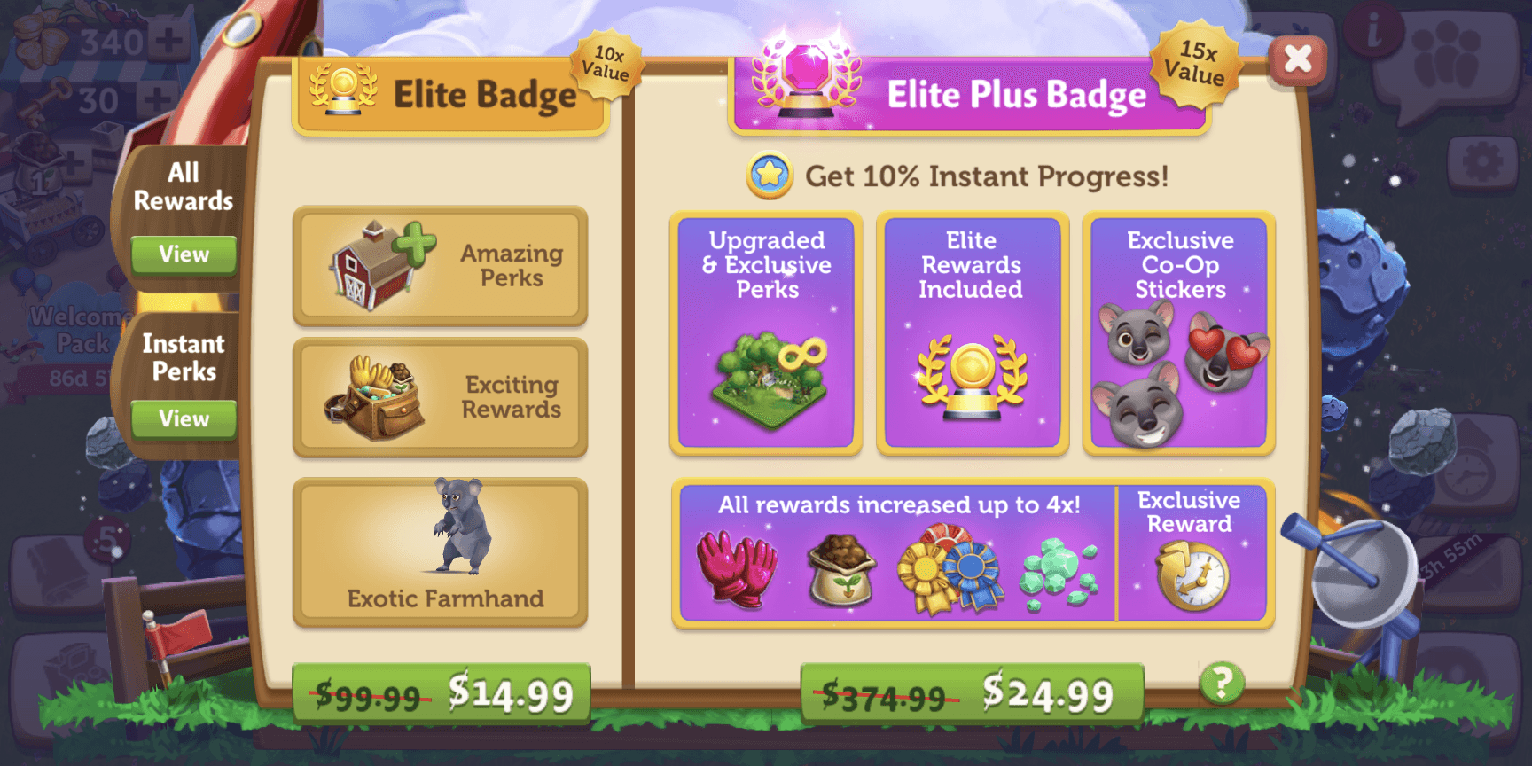 1234
- 1Comparison screenOne tap to see every reward side by side
- 2Perks tabAdded later, after early feedback
- 3Double the spacePremium gets twice the room of Elite
- 4PerksShown up front, before you buy
Every reward, side by side
A new screen for the game: scroll through the whole track while the exclusive rewards stay pinned.
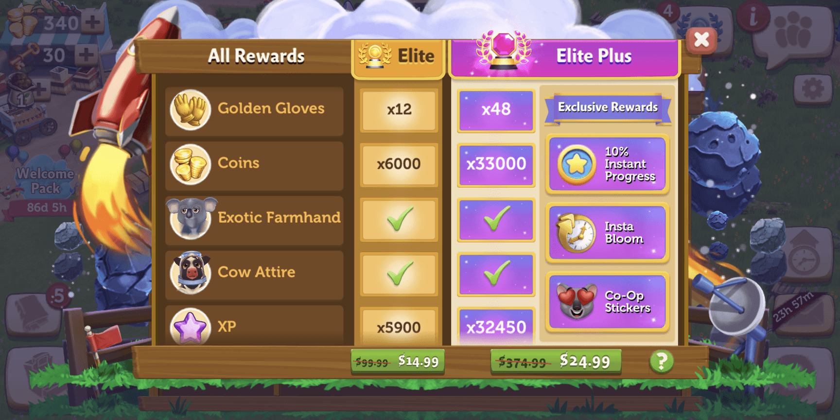 12
- 1Scrollable sectionEvery reward for both passes
- 2Fixed exclusive rewardsPremium-only rewards never scroll away
A side-by-side comparison, Elite vs Premium
The game had never shown two passes next to each other. This screen lays every reward out in two columns, so the extra value is impossible to miss.
Perks that explain themselves
Each perk says when it applies, and Premium perks sit higher on the page.
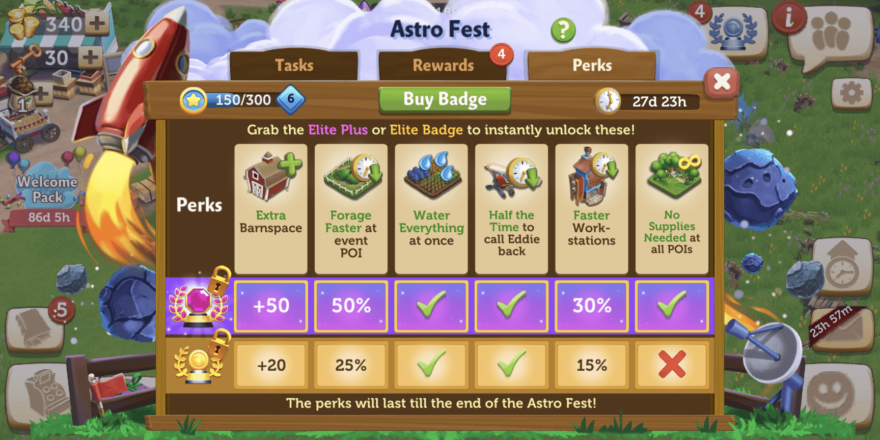 12
- 1Condition-based labelSays which pass unlocks the perks
- 2Higher visual hierarchyThe Premium row sits on top and glows
A spotlight the first time you open the pass
On first open, a spotlight overlay points at the Premium Pass and explains it in one line, then gets out of the way.
A Premium milestone feels grander
Reaching a Premium milestone plays a bigger, brighter burst than an Elite one, so the reward feels worth what was paid for it.
Locks wiggle to nudge the upgrade
Locked Premium rewards give a small wiggle as you scroll past, a quiet reminder of what you're missing without a pop-up.
Perks light up when they're active
Once bought, each perk switches to an active state, so players can see their boosts working for the rest of the event.
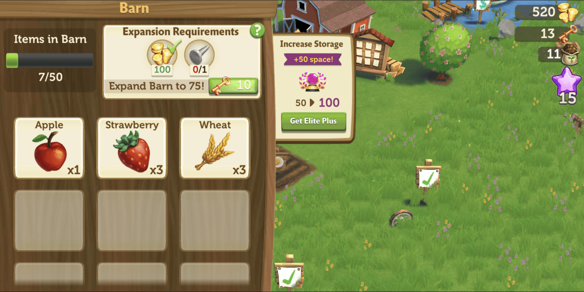
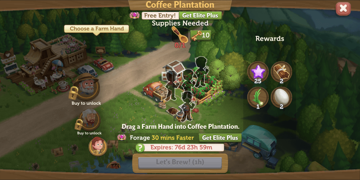
The pass shows up where players already are
Small Premium hooks inside features players use every day.

Players paid more, and played more
Launched to FarmVille 2's 400K+ daily active players.
Thank you for reading!
Let’s make something clear.