Moving purchases to Zynga’s D2C webstore
- Role
- Lead UX designer
- Team
- Director of product, analysts, devs
- Tools
- Figma, Unity, Adobe Suite
Creating trust with paying users to safely redirect them to an external store to gain additional value.

FarmVille 2 is Zynga’s live mobile farming game, and every purchase in it went through the App Store or Google Play. I led the UX for bringing Zynga’s webstore into the purchase screens players already used, rolled out in four stages.
How much does a studio actually earn everytime there is a purchase?
30-40% goes to a 3rd party platform
Players buy Keys, the premium currency, through Apple or Google.
The studio keeps 100% of it
And can give part of it back to the player as extra Keys.
The studio is losing so much money to third parties! How can we avoid this?

Wrong.
Asking a player to leave the game mid-purchase hands them one more chance to rethink it.
The biggest difficulty is keeping their trust.
First step: find the single highest point of purchase in the game, and start there.
The research here was quantitative.

The highest-traffic purchase point was a massive risk. But it would also give the most reliable data, show real change in purchase behaviour, and surface useful player insights during A/B testing.
Purchase traffic across every point of purchase in the game, worked out closely with PMs and analytics.
Honesty builds trust
Players will leave the game only if they know exactly where they’re going, and what extra they get for it.
A playful toggle on the store: flip it on, the cards recolour, Keys visibly increase, and every button opens the webstore.
One toggle, three states
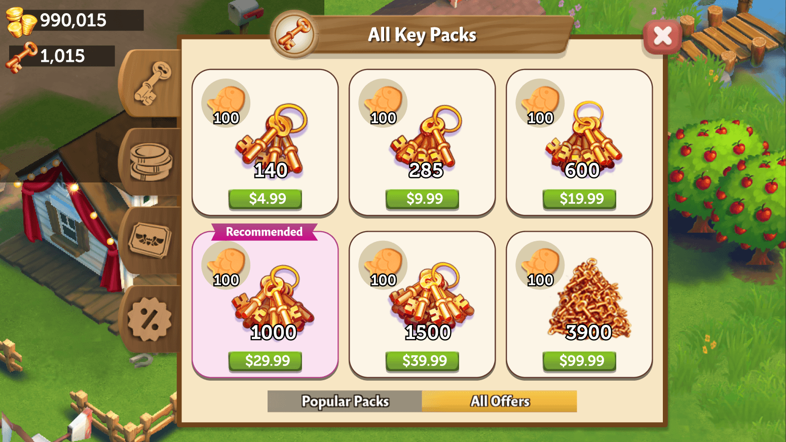
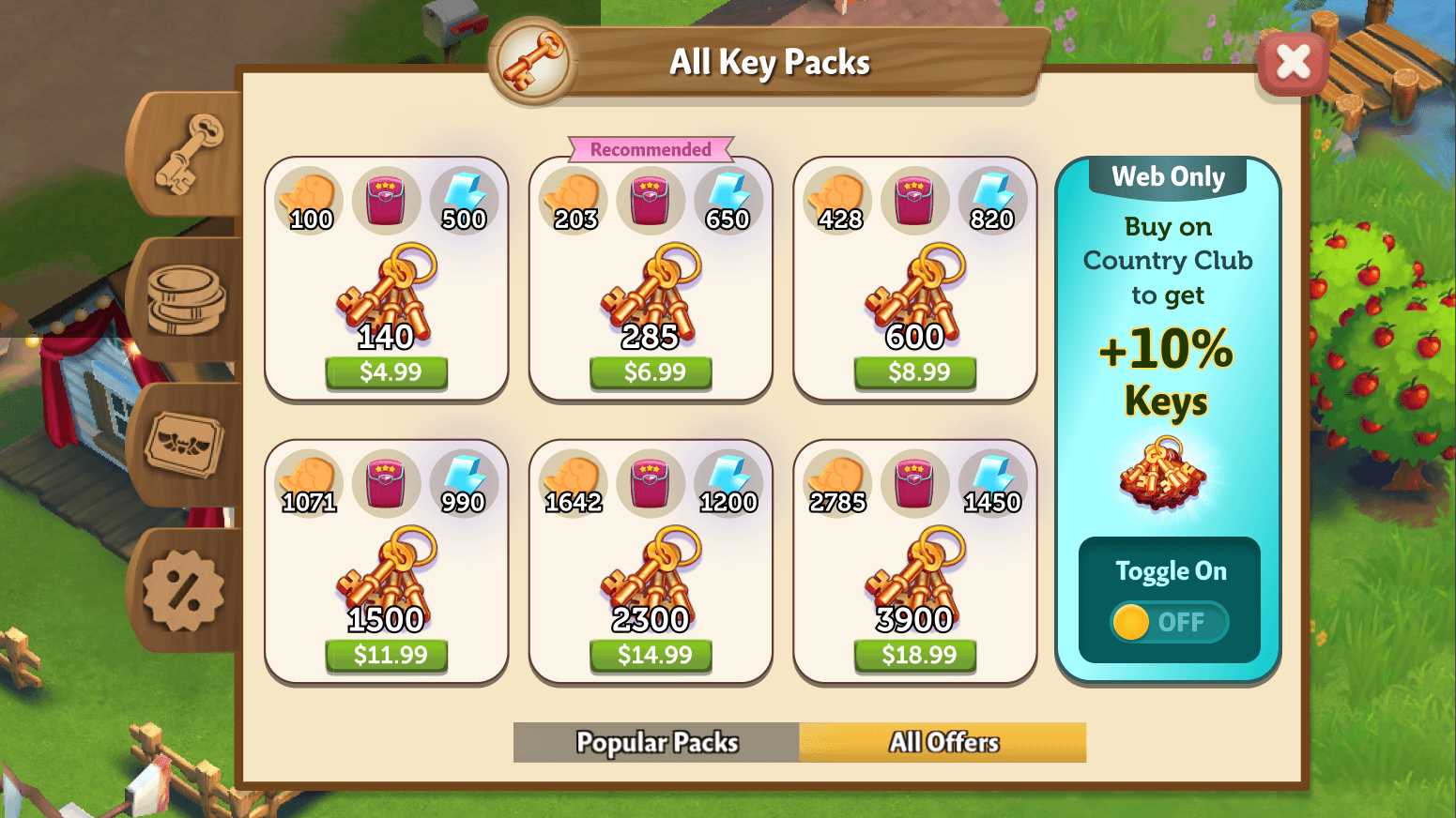
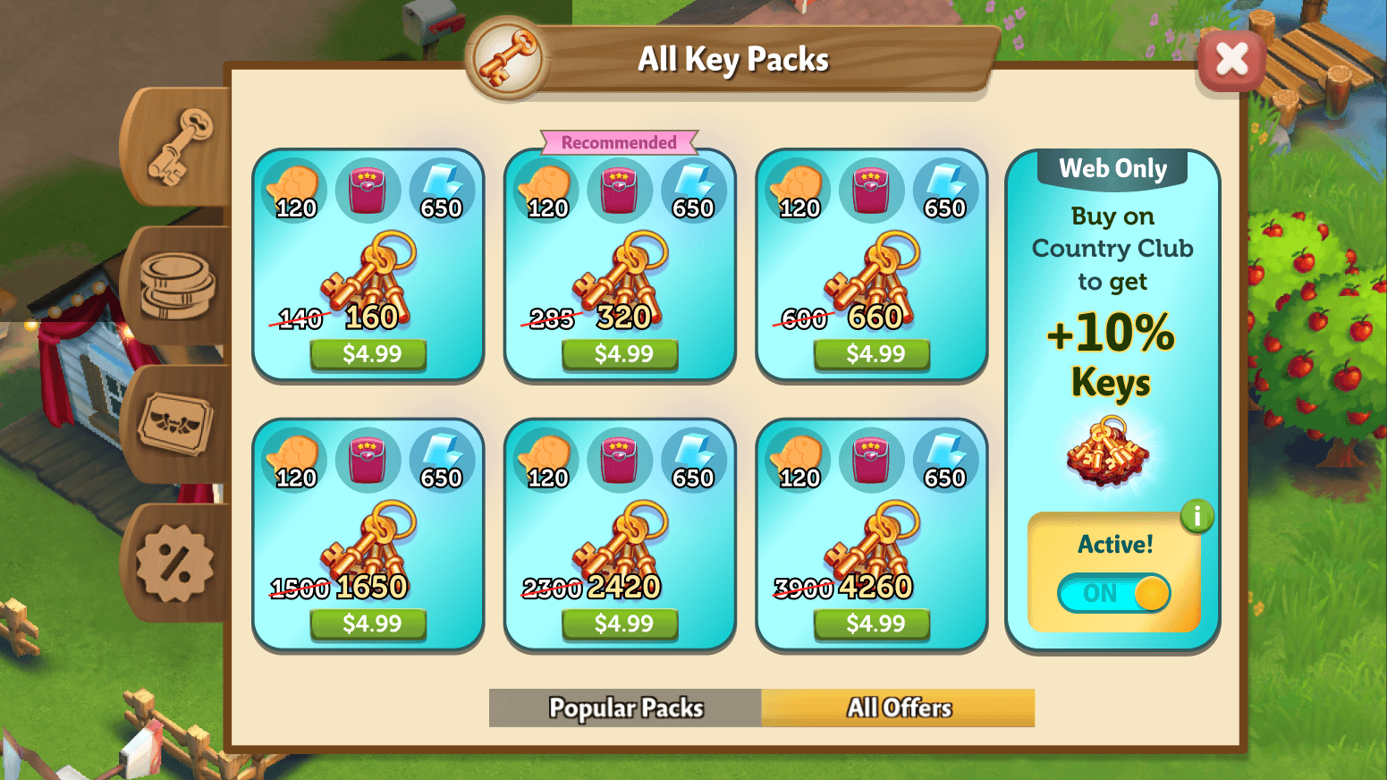
Something new, on a screen where people spend real money. A short walkthrough introduces the toggle before anyone uses it.
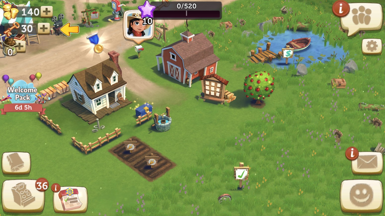
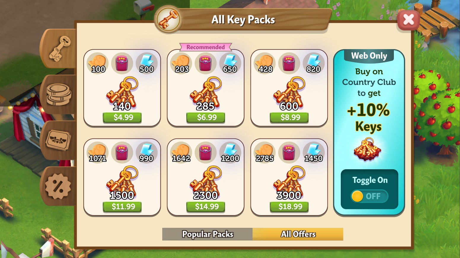
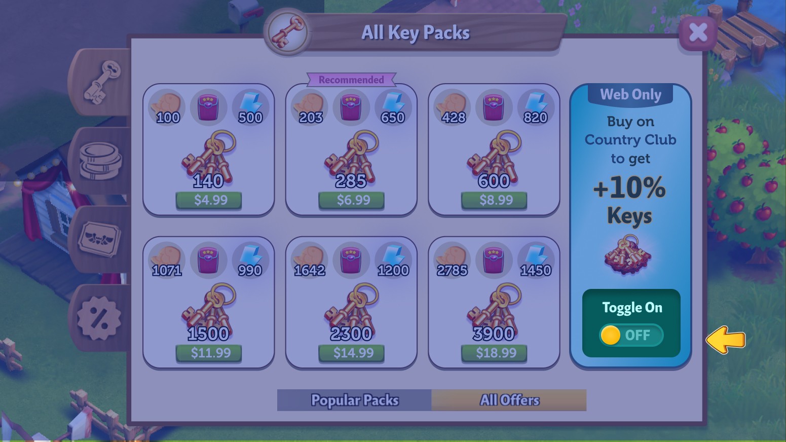
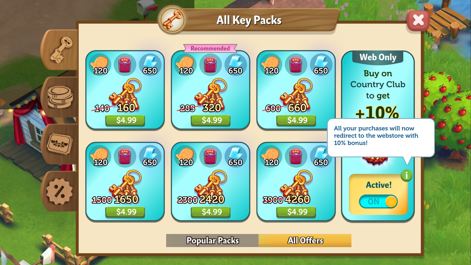
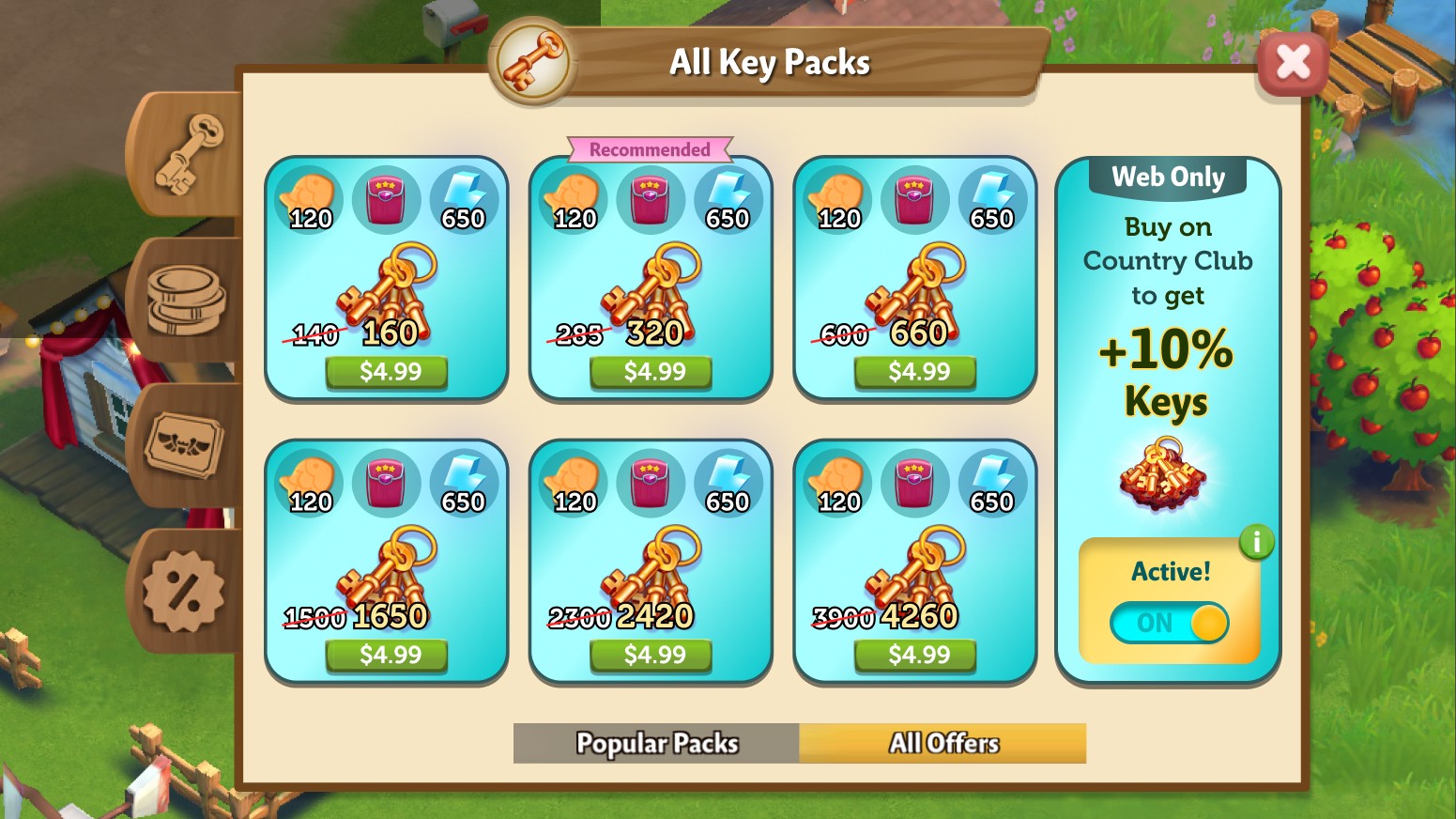
Two ways to the webstore: switch the toggle on before buying, or pick web at checkout. The in-app route never goes away.
Realised the system wasn’t scaling
Making room for the toggle in 16 other purchase points wasn’t going to scaleIt would break existing functionality and add a lot of risk.
So the redirect moved behind a tap instead of sitting on the screen as a toggle or button, after they’ve decided to buy.
The decision to buy is already made, so the webstore becomes an opportunity to gain more for the same price.
Creating trust through habits
The monthly battle pass is a progression feature, and where the most engaged players check in every day. Non-payers never open the in-app store, so a daily free-gift task surfaced the new webstore to them.
It also got them used to an external redirect.
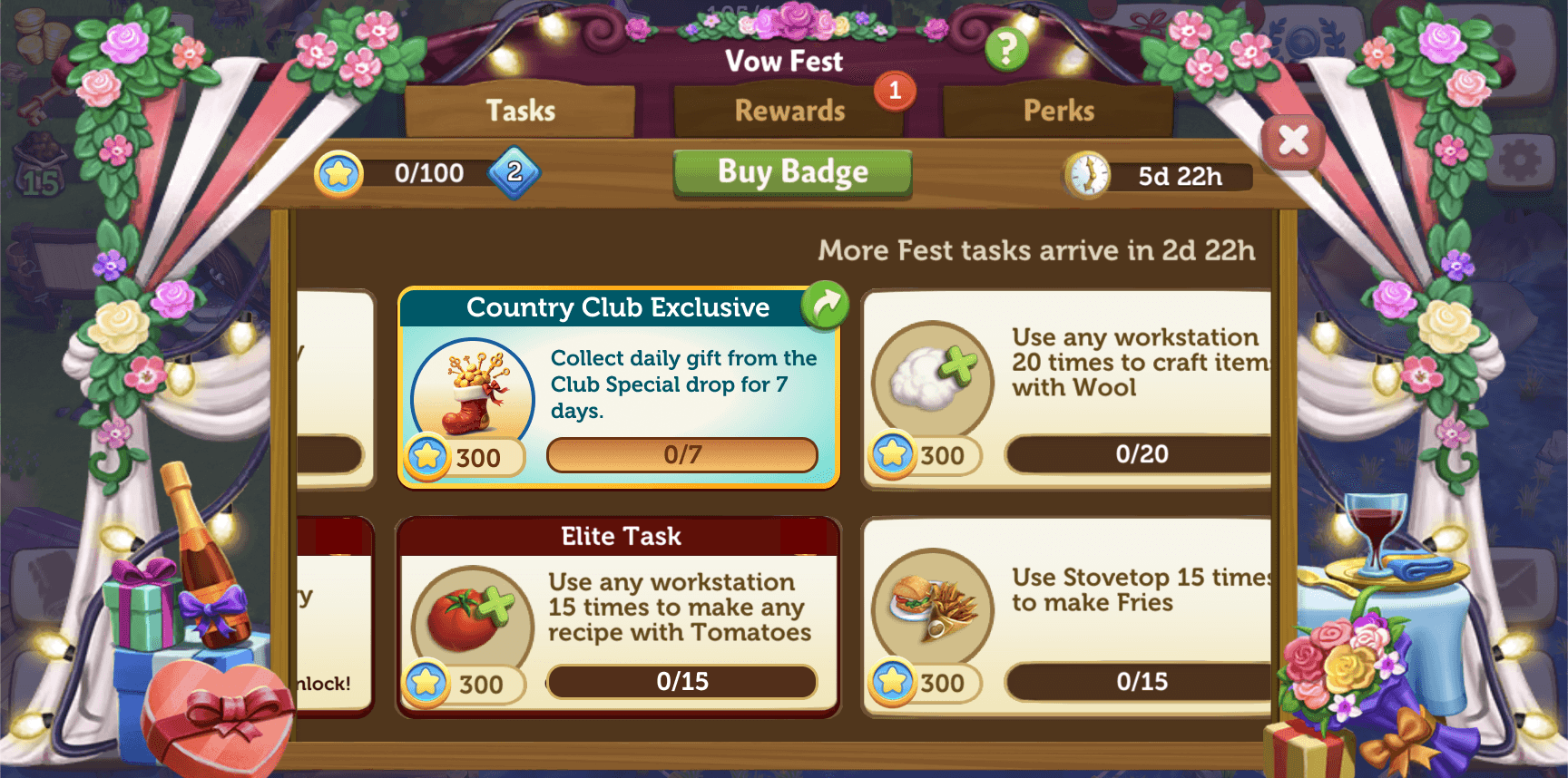 Battle pass · free webstore gift task
Fixing the actual webstore players go to
Analytics and earlier interviews showed three problems on the mobile webstore.
Rewards looked tappable
They looked like tabs that would expand.
Bonuses went unnoticed
No callouts for web-exclusive extras.
Packs were hard to find
Players couldn’t find the pack that suited them.


Filters
Narrow down packs fast.
Cleaner cards
Nothing that looks expandable.
Tooltips
On every reward icon.
One background
Flows from the splash banner.
Themed families
Grander packs, richer themes.
Creating consistency with the Zynga family
Packs from the same family now sit in their own visual hierarchy, with much clearer icons.
The headers double as separators and form a reusable system. It builds on Zynga’s existing design system, so it matches the webstores for FarmVille 3, Merge Magic and Merge Dragons.
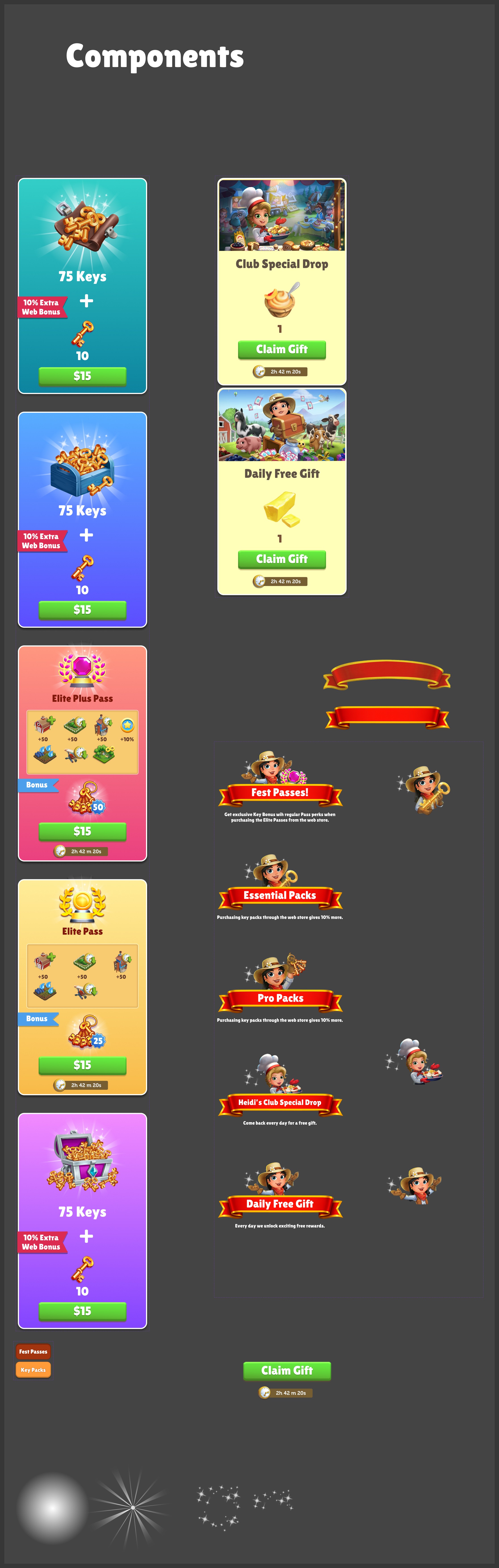
Worked closely with the Direcor of product to A/B test bold designs.
It saves Zynga $8,000 every month, and it’s been recurring revenue to date.